
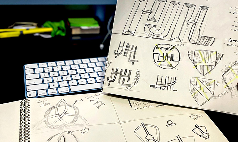
An In-depth Look at My Logo Design Process
Maybe you’re starting a new business. Maybe you’re launching a product, developing a new brand, or putting together an event. At some point, you’re probably going to start thinking about a logo. And it’s an important decision.
Your logo will appear on your website, social media, signage, business cards, advertising, packaging, apparel, and just about anywhere else your brand shows up. Over time, it can become one of the most recognizable parts of your business.
But a good logo isn’t just about creating something that looks nice. It needs to represent the business, connect with the right audience, and work consistently across a wide range of applications.
When I’m asked to design a logo, there are a few things I consider before I ever start working on concepts.
1. Do You Actually Need a New Logo?
Most businesses need a logo. That’s fairly straightforward. But not everything a business creates necessarily needs its own separate logo.
If you’re launching a new product, service, event, or division, it’s worth asking whether it needs a completely new visual identity or whether it should remain connected to your existing brand.
I usually start by considering a few basic questions:
- What are the marketing and advertising goals?
- Where will this identity be used?
- Who is the target audience?
- Does it need to stand on its own or support an existing brand?
- How are competitors presenting similar products or services?
The answers help determine how far the branding needs to go. Sometimes a completely new logo makes sense. Other times, a strong name, consistent typography, colours, and supporting graphics are enough.
The goal isn’t to create another logo simply because you can. It’s to build a visual identity that makes sense for the business and how it communicates with its customers.
2. Understanding the Business Comes First
I don’t start a logo design project by opening design software. I start with research.
Before designing anything, I need to understand the business I’m designing for. What does the company do? Who are its customers? Who are its competitors? What makes it different? How does it want to be perceived?
Those answers influence almost every design decision that follows.
Colour, typography, shapes, symbols, spacing, and overall style should have a reason for being there. They shouldn’t simply be chosen because they’re currently popular or because they look good on a screen.
I also spend time looking at the industry itself.
The goal isn’t to copy what competitors are doing. Quite the opposite. Understanding the visual language of an industry helps identify opportunities to create something distinctive without designing something that feels completely disconnected from the market.
Good logo design starts with understanding the business. The actual designing comes later.
3. Keeping the Logo Simple
Once I begin developing concepts, one of my biggest priorities is simplicity. It’s easy to keep adding things to a logo. Another shape. Another line. Another colour. Another graphic element. The harder part is knowing what to remove. I continually edit concepts throughout the design process, eliminating anything that doesn’t contribute to the overall idea.
A logo needs to communicate quickly. Someone might see it on a highway sign for a few seconds, scroll past it on social media, or notice it in the corner of an advertisement.
They shouldn’t have to study it to understand it.
Simple doesn’t mean boring. It means the design has been refined until every element has a purpose.
There are thousands of businesses competing in the market to draw the attention of a limited number of customers. The successful companies are the ones that successfully create a unique identity for themselves. It is my job as a graphic designer to assist these companies in creating this identity and turning their logos into a marketing tool.
4. Finding an Original Idea
One of the challenges with logo design is avoiding the obvious. If you’re designing for a trucking company, putting a truck in the logo is probably one of the first ideas that comes to mind. Designing for an Eagles sports team? An eagle head seems like the natural choice.
There’s nothing inherently wrong with either approach, but if every competitor reaches the same conclusion, it becomes difficult for any one brand to stand out.
This is where research, sketching, experimentation, and inspiration become important. Identifying 10-15 nouns that represent your company/organization becomes imperative for a brand designer to develop concepts that will allow you to stand apart from your competitors.
I’m constantly noticing logos, typography, signs, packaging, architecture, colours, and interesting visual ideas. Sometimes inspiration comes from looking at other design work. Other times, it comes from something completely unrelated.
The goal isn’t to create something different simply for the sake of being different. It’s to find an idea that’s relevant to the brand while giving it an identity people can remember.
5. Starting in Black and White
Colour can make almost any design more visually interesting, which is exactly why I don’t rely on it at the beginning of the process.
I want to know whether the underlying logo works first. Starting in black and white forces me to concentrate on the fundamentals: shape, balance, spacing, typography, contrast, and overall composition.
If a concept isn’t working without colour, adding a nice palette probably isn’t going to solve the problem.
This stage also allows me to test scalability. A logo might look great filling an entire computer screen, but what happens when it’s reduced to the size of a social media profile image or printed on a business card? On the other end of the spectrum, will it still look professional when it’s enlarged for a vehicle graphic, storefront sign, trade show display, or billboard?
A well-designed logo needs to work at both extremes.
6. Adding Colour and Typography
Once the core design is working, I begin developing the complete visual identity. Colour is obviously an important part of this process, but I don’t choose colours based solely on traditional ideas about what individual colours supposedly mean.
Context matters much more.
I look at the company’s existing brand, its industry, competitors, target audience, and the overall personality we’re trying to communicate. A colour combination that works perfectly for one company could feel completely wrong for another.
Typography deserves the same consideration. The right typeface can make a brand feel established, contemporary, approachable, technical, premium, playful, or professional. Even small adjustments to spacing, weight, and proportions can dramatically change how a logo feels.
This is where the individual pieces start working together as a complete identity.
A Logo Needs to Work in the Real World
One of the most important parts of logo design is remembering where the finished product will actually be used.
I’m not designing something just to look good in a presentation. I’m thinking about websites, social media, business cards, brochures, signage, apparel, vehicle graphics, advertisements, packaging, and whatever other applications the business might need now or several years down the road.
That means considering different orientations, colour variations, file formats, and simplified versions where necessary. A business shouldn’t have to redesign its logo every time a new application comes along.
Final Thoughts
Businesses are competing for attention every day, and strong branding helps people recognize and remember who you are.
Your logo is only one part of that brand, but it’s an important one.
Good logo design combines research, strategy, creativity, and plenty of refinement. The finished product should look professional, but more importantly, it should make sense for the business behind it.
That’s ultimately what I’m trying to accomplish whenever I start a logo design project. I’m not just creating a graphic. I’m creating something that a business can confidently put its name behind for years to come.