Web Design:
Platinum Fitness Innisfail
I was thrilled to get this call. Stephen Saar, the owner of Platinum Fitness in Innisfail, Alberta, was one of my first web design clients back when I was still in school. Let’s just say, I had a lot to learn, and unfortunately, Stephen ended up with a domain name that didn’t quite fit his business and a less-than-stellar design.
For over six years, I’ve been nudging Stephen to let me create a new website from scratch to better represent both our businesses, but mainly his. We set off on a mission to secure new web hosting services, a better-suited domain name, and an awesome new design that leverages everything I’ve learned over the past decade.
Project Details
Client: Quinton
Date: February 2024
Skills: Web Design
Visit: https://platinumfitnessinnisfail.ca/
Number of Pages
Initial Turnaround Days
Think.
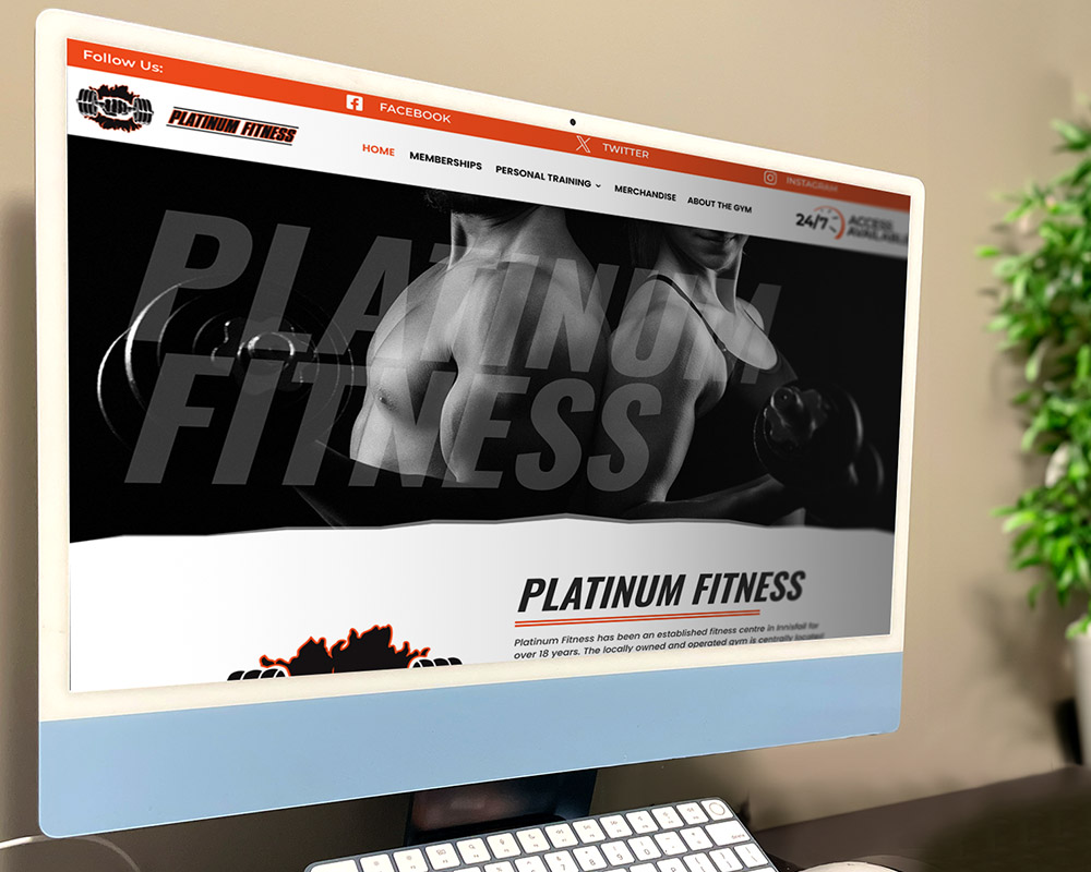
For Platinum Fitness in Innisfail, I envisioned a highly functional website that makes it easy for visitors to find key information about the gym—membership rates, equipment/facilities, and contact details.
My focus wasn’t just on developing a new website; I aimed to help Stephen build a cohesive brand. This meant creating impactful imagery, establishing a text hierarchy, and crafting a branding message centred on strength and inclusion. These elements would serve as a foundation for Stephen’s social media channels and any future marketing materials.
Design.
The first task in rebuilding the website for Platinum Fitness was to correct my earlier mistakes. Initially, I secured a .org domain for Stephen, which is typically used for non-profit organizations, not fitness businesses. This misrepresentation needed rectifying, so we transitioned to a more appropriate domain and hosting plan.
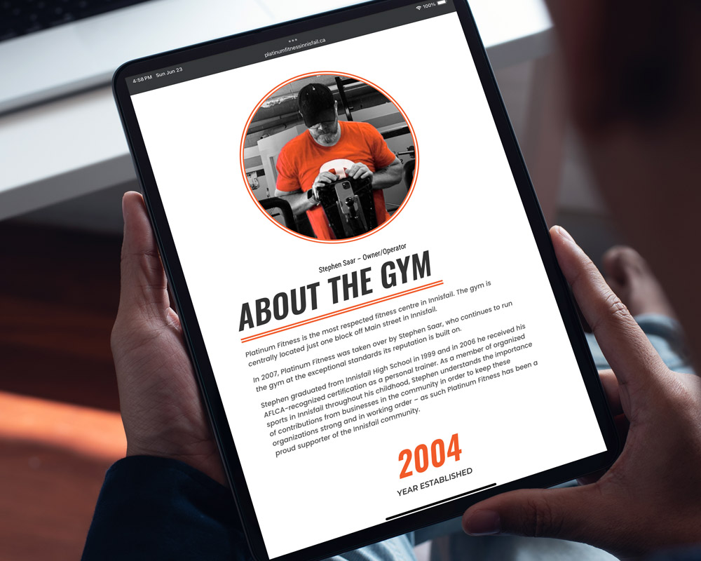
With the technical details sorted, I visited the gym to capture updated photos of the facilities and equipment. The gym had added several new machines, which needed to be highlighted on the site. Stephen also provided me with information about the gym’s history, current membership, and community involvement. This helped in creating a comprehensive and engaging website.
Key Focus Areas for the New Design
- Membership Pricing: Clear and accessible information on membership rates.
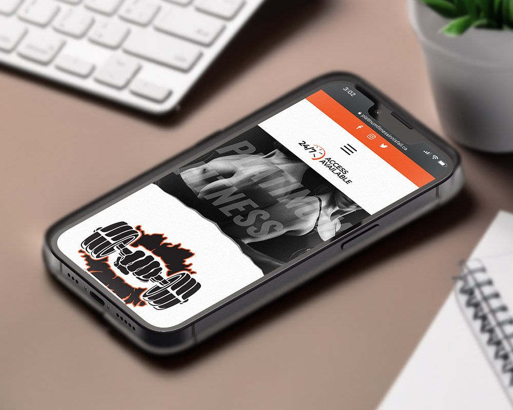
- 24-Hour Access: Emphasizing the convenience of around-the-clock availability.
- Membership Waiver Form: Easy access to essential forms for new members.
- Overall Aesthetic: An updated look and feel to reflect the gym’s dynamic atmosphere.
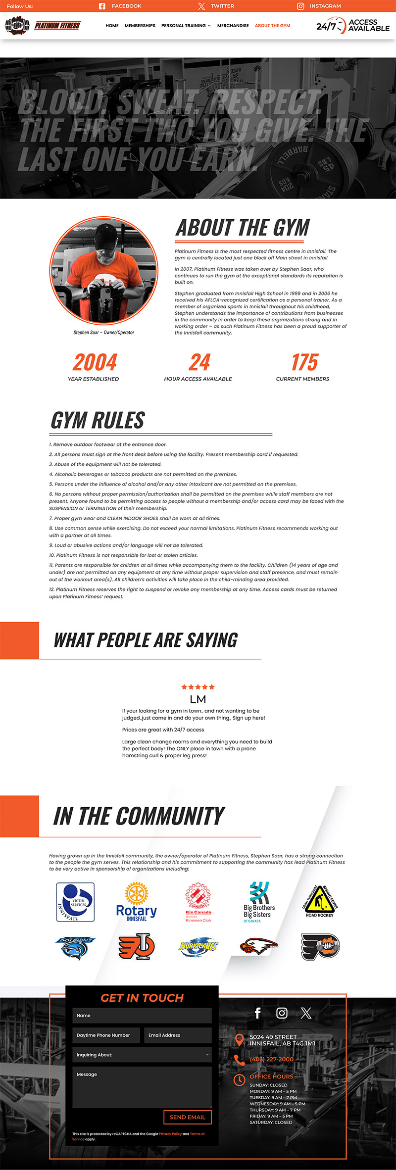
During my visit, I noticed the inspirational quotes and messages adorning the gym walls. This inspired me to feature similar quotes in the hero sections of each webpage, paired with powerful images that embody fitness and personal growth. This approach underscores the gym’s commitment to its members’ success.
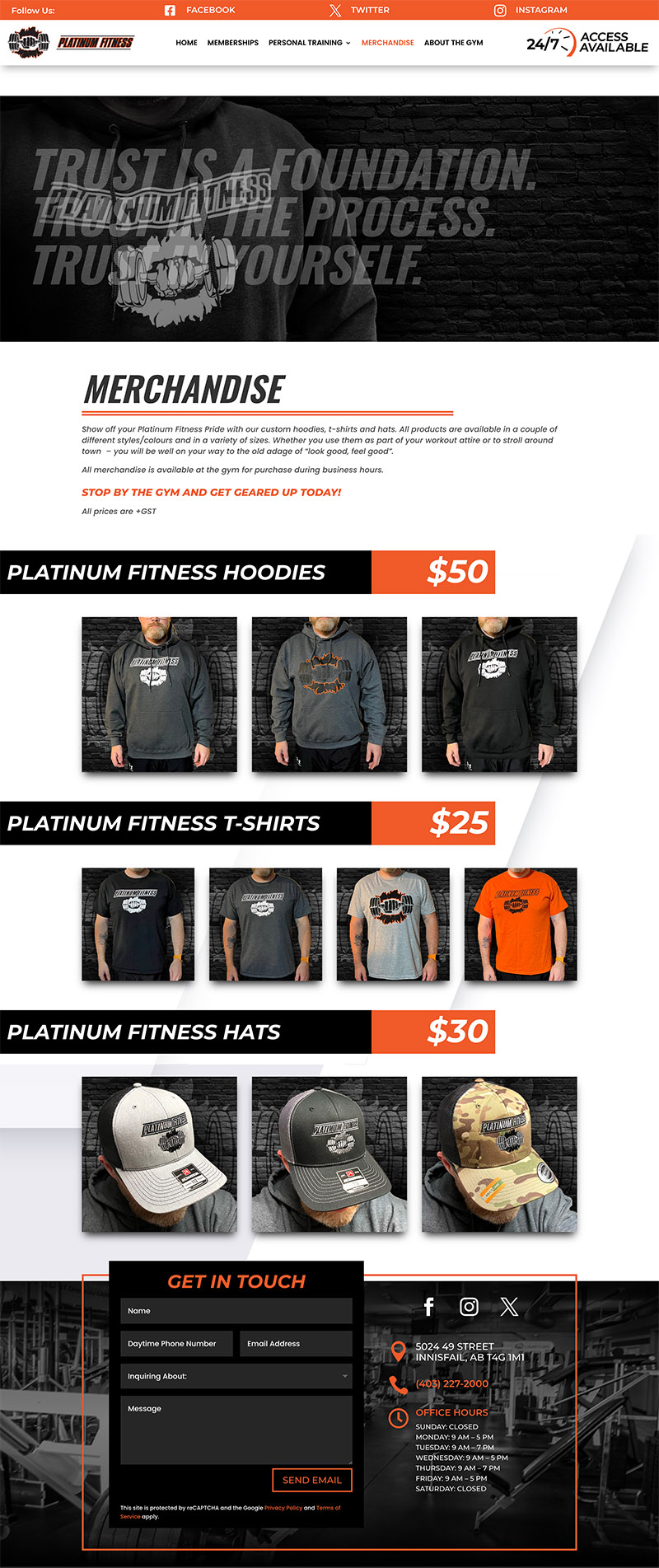
Each page was carefully crafted to include the necessary information, supported by fitting imagery. The aim was to ensure that key information was bold and immediately noticeable to visitors. To add a vibrant touch to the black-and-white logo, Stephen and I incorporated a pop of orange, enhancing the overall visual appeal.
This project not only revitalized the Platinum Fitness website but also solidified its brand, making it a true representation of strength and inclusion.
Connect.
The Platinum Fitness website design is bold, making a powerful statement. From the layout and information flow to the colour combinations and font hierarchy, every element is crafted to ensure visitors can easily navigate the site and stay focused on their goals.
This web design serves a singular purpose: providing potential clients with a comprehensive understanding of Platinum Fitness, who they are, and what they offer. The site features interactive contact forms, a dynamic membership page, and a clear, easy-to-read layout that highlights everything from personal training options to available merchandise.
I’m thrilled Stephen allowed me to revamp his site. It was a project I’d been eager to tackle, and I believe the new design truly reflects the strength and inclusivity of Platinum Fitness.

