Graphic Design:
Pop-Up Banners –
MEE Cluster
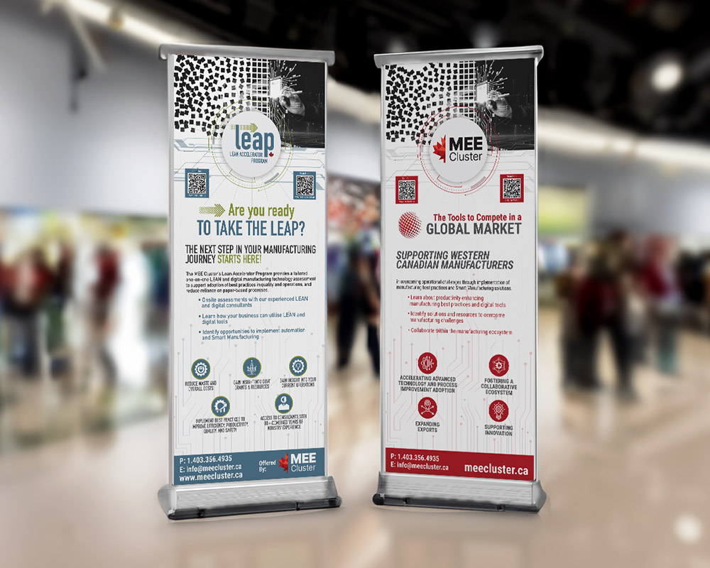
The Manufacturing & Export Enhancement (MEE) Cluster is dedicated to helping Western Canadian manufacturers tackle operational challenges with cutting-edge manufacturing best practices and smart solutions. After successfully wrapping up the 2023 SmartMTX Post Show Report, MEE Cluster brought me on board to revamp their company’s current pop-up banner and design a fresh one for their new LEAP program. These banners will become essential for showcasing the MEE Cluster and LEAP brands at tradeshows, conferences, and networking events.
Think.
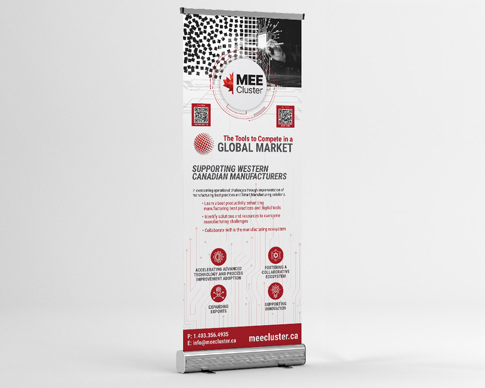
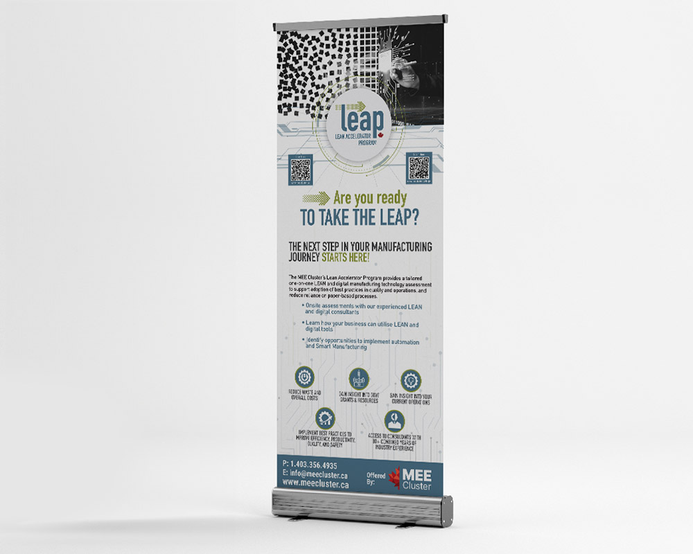
The existing pop-up banner design for MEE Cluster and their LEAP program was stale and basic, lacking visual interest and failing to capture the innovative essence of the brands. After a detailed discussion with Peter, it became clear that the new design needed to visually represent the transformation of “Chaos into Order,” mirroring what the MEE Cluster achieves for its clientele. This project required adhering to MEE Cluster and LEAP’s branding guidelines, including specific colours and fonts, while incorporating modern imagery and custom tech-related icons such as computer chip graphics and strategically placed lines.
Design.
Step 1. The creation process began with brainstorming and sketching out concepts that could effectively convey the “Chaos into Order” message. I found a great stock image to work with and then utilized my Illustrator skills to create an image mask of chaotic squares moving into organized order to create the final image – used at the top of both banners.
Step 2. Integrate bold, modern imagery and custom icons related to the tech field to enhance the visual appeal. The existing pop-up banners had no flow for the eye to follow the information in an organized manner. By creating these icons I was able to pair them with the important information.
Step 3. Utilizing a clear text hierarchy, I organized the information within each brand’s guidelines to guide viewers through the content seamlessly.
Step 4. Recognizing that pop-up banners are meant to be viewed quickly, I reduced the provided text to concise bullet points, ensuring key messages were easily digestible.
Step 5. To provide easy access to additional information, QR codes were added, allowing viewers to quickly scan and explore further details about MEE Cluster or the LEAP Program.
Connect.
The final products were two cohesive and visually striking banners that communicated the core messages of MEE Cluster and the LEAP program effectively. The modern design touches, including the use of tech-inspired graphics and a well-structured text hierarchy, made the banners more engaging and informative. The banners brought a fresh, dynamic look that drew attention at tradeshows, conferences, and networking events.
Graphic Design Skills Used: Photo Editing; Supporting Graphic Creation; Layout Design; Colour Theory; Typography


