Logo Design:
Red Deer Roller Hockey Association
Darcy, the President of the RDRHA, hit me up via email looking for a logo or logos to move the organization into the future. He had seen some of my previous work with the Red Deer County Club and thought my skills could create something DYNAMIC and FUN for the kids. He wanted it to include icons or symbols related to the city of Red Deer and unique element of roller hockey. With all the insights from our consultation, I set out to craft the perfect logo for his brand.
Project Details
Client: Darcy
Date: February 2023
Skills: Logo Design
Initial Concepts
Number of Designs
Turnaround Days
Think.
When Darcy with the Red Deer Roller Hockey Association reached out for a new logo design, I knew it had to be something special. The goal was to create a logo that would shine across various mediums—jerseys, hoodies, hats—you name it. The logo needed to exude the pride of the city of Red Deer while being FUN and APPEALING to a wide age range of kids from 6 to 17.
Design.
To achieve this, I conceptualized three distinct ideas:
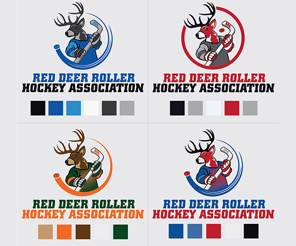
- Deer Representation: The first concept focused on a powerful deer, symbolizing the City of Red Deer. The deer embodies the spirit and pride of the city, making it a perfect centrepiece for the logo.
- Roller Hockey Player: The second concept was centred around a dynamic roller hockey player. This design captures the action and excitement of the sport, making it instantly recognizable and exciting for young players.
- Text-Based Logo: The third concept was a bold, text-based logo. This design emphasizes the association’s name with stylish typography, ensuring versatility and easy recognition across all mediums.
These three concepts aim to cover all bases, providing a comprehensive range of options that reflect the identity and energy of the Red Deer Roller Hockey Association.
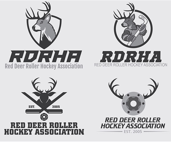
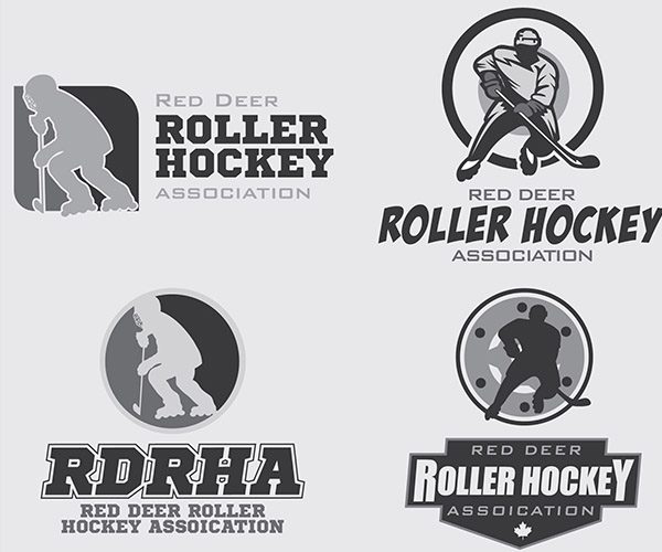
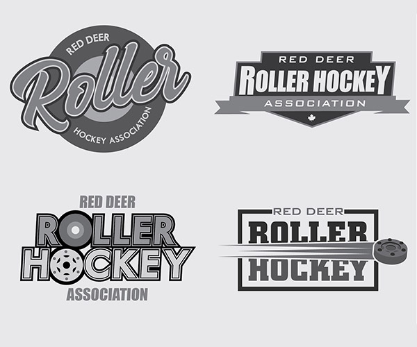
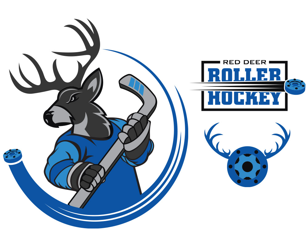
Once the concepts were ready, I presented them to the board of directors where we hit a good problem – they loved multiple designs! From there, the project pivoted into a full rebrand for the association. We created a primary logo for the jerseys, a secondary logo for shoulder patches, and a third logo for the business side of the association.
Once the logos were finalized, it was time to explore colour schemes. I presented four different colour pairings to the board:
- Blue and Greys – Blue evokes trust, loyalty, and confidence, perfect for representing a sports team. Paired with greys, it adds a sleek, professional look that’s modern and versatile.
- Reds and Blacks – Red symbolizes energy, passion, and action, which is great for a high-energy sport like roller hockey. Combined with black, it creates a bold, powerful contrast that’s eye-catching and intense.
- Greens and Browns – Green represents growth, harmony, and freshness. When paired with earthy browns, it gives a natural, grounded feel, emphasizing teamwork and community.
- Reds and Blues – Red brings the energy and excitement, while blue adds a layer of trust and dependability. This combination is vibrant and dynamic, appealing to both kids and parents alike.
Each scheme was designed to communicate different aspects of the association’s values and mission, allowing them to choose the one that best represented their brand. In the end, the choice was made to go with the blue and grey and it was applied to the 3 logos.
Connect.
The chosen Deer concept for the Red Deer Roller Hockey Association’s logo was a hit, and it sends a clear, dynamic message to its audience. This logo, featuring a proud and powerful deer, symbolizes the spirit of the city of Red Deer and embodies strength, agility, and community pride. It’s a design that speaks to the heart of every player and supporter, making it instantly recognizable and deeply meaningful.
Working on this project was an absolute blast! From brainstorming sessions to seeing the final design come to life, every step was filled with creativity and excitement. The real thrill, though, came from seeing the logo on the vibrant roller hockey jerseys. Watching the kids’ faces light up when they put on their new jerseys was truly rewarding. It’s more than just a logo; it’s a symbol of their passion and dedication to the sport.
This project wasn’t just about creating a logo; it was about crafting an identity that the kids could wear with pride, and the smiles on their faces are the best feedback we could ever ask for.
Graphic Design Skills Used: Vector Graphic Creation; Layout Design; Colour Theory; Typography
