Logo Design:
Prime Physiotherapy & Athletics
Ruel hit me up via email looking for a logo for his new physiotherapy venture in Red Deer. He had a clear vision: a MODERN, DYNAMIC logo that screamed movement and professionalism. He wanted it to include icons or symbols related to physical therapy (e.g., body movement, flexibility, anatomy). With all the insights from our consultation, I set out to craft the perfect logo for his brand.
Project Details
Client: Ruel
Date: March 2022
Skills: Logo Design
Initial Concepts
Number of Designs
Turnaround Days
Conceptualize
During our consultation, Ruel mentioned that he wanted to base his logo design around the idea of the ‘P’ in the word Prime. However, I wanted to present a few different concepts to see if there was another way to convey the ideas of movement, health and wellness. As a logo designer, I must understand the main brand message and audience and how to convey it. This particular logo had to appeal to a broad audience, from athletes to seniors.
Create
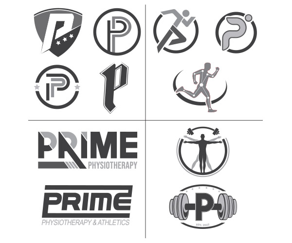
For Toro Skid Steer, I developed four logo concepts and created 11 designs from those concepts.
- Different concepts based on the client’s request of utilizing the letters of the business. Each design had its layouts and ways to communicate the idea of movement, professionalism and wellness.
- Concepts that took the idea of movement and integrated different ways to convey that with direct imagery. I was able to incorporate the “P” into a few of the designs as well.
- I created text-based or wordmark options for Ruel as well. These aren’t usually ideas that get selected unless someone is specifically looking for one – but it’s nice to provide this option as sometimes these concepts can be paired with other design concepts to create the final logo.
- The final concepts were based on the concepts of movement and strength. Using symbolism such as weights
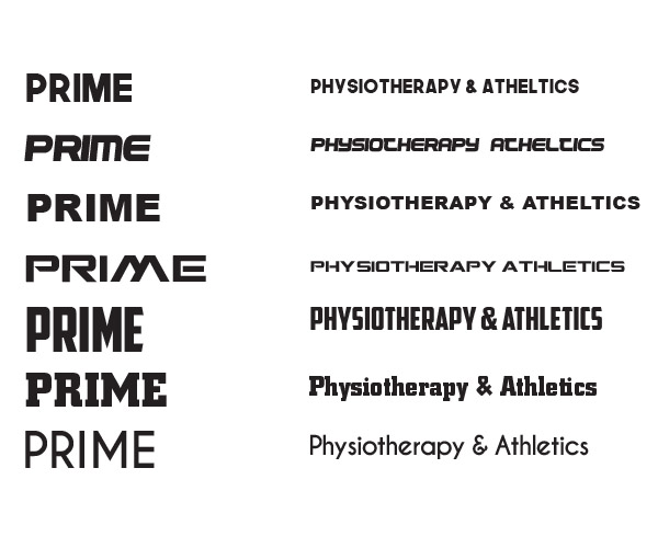
During the creation process, I always include a variety of typeface samples to complement the concepts I present. Since Ruel wanted a MODERN and BOLD look, I provided several font options that align perfectly.
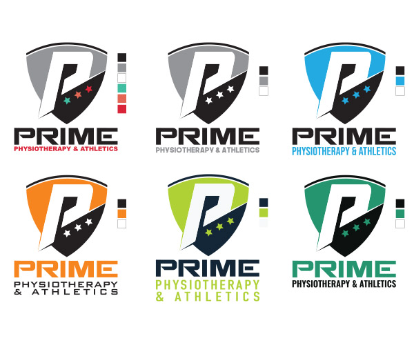
Sometimes a client likes one of the original concepts so much that no revisions are needed. Ruel immediately fell for the postured bull design. From there, I moved on to adding colour to the chosen design. After thorough research, I presented several variations, carefully aligning the colour choices with our branding discussion and leveraging color psychology effectively.
Communicate
The final logo design for Prime Physiotherapy captures the essence of movement, health, and wellness that Ruel envisioned for his practice in Red Deer. From athletes to seniors, the design reflects these values, ensuring it resonates with every client who walks through their doors.
Graphic Design Skills Used: Vector Graphic Creation; Layout Design; Colour Theory; Typography


