Logo Design:
Platinum Farm & Oilfield
At Arktos, every logo tells a story. Colby hit me up through my website looking for a fresh logo for his farm and oilfield business. What made this project unique? We never had a face-to-face chat! I sent over my usual logo design questionnaire, and Colby put his trust in me to bring his vision to life. The logo needed to be bold, simple, and modern, perfect for business cards and apparel.
Project Details
Client: Colby
Date: January 2023
Skills: Logo Design
Initial Concepts
Rounds of Revisions
Turnaround Days
Think.
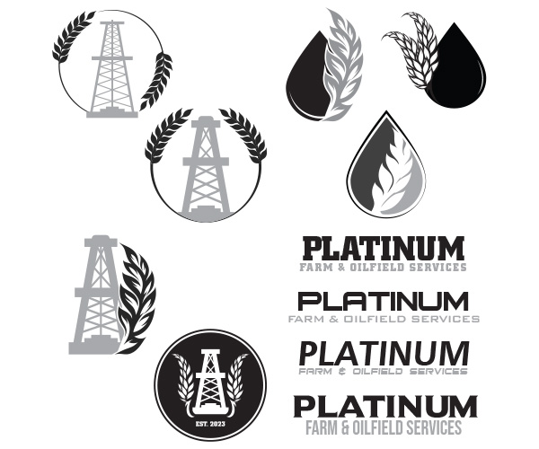
Colby had a clear vision: he wanted an oil derrick and a wheat stalk in his logo. While that’s straightforward, I felt it needed a bit more flair to really stand out from the competition. So, I made sure to include his ideas in one of the concepts, but I also got creative with some alternative designs. My goal was to spark Colby’s imagination and show him what his logo could truly be.
Design.
I created seven different designs based on three concepts. The first concept incorporated Colby’s idea of the oil derrick and wheat stalks. I made two variations, each with a modern, simple approach by placing different oil derricks in the center of a circle with wheat stalks. The second concept was a twist on the first, using more contemporary wheat stalk drawings arranged more freely. For the final concept, I replaced the oil derrick with an oil drop, creating three unique designs with the wheat stalks.
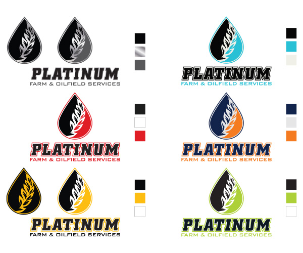
After Colby reviewed the concepts, he asked for minor tweaks, like using a different wheat stalk in his favourite design. Next, I added colour to the design. Colby wanted a metal (platinum) texture, which I explained wouldn’t work well for apparel, but he still wanted to see it. The design also allowed for the “oil drop” to be split into two colours if desired. I presented various colour combinations that matched the message Colby aimed to convey to his potential customers.
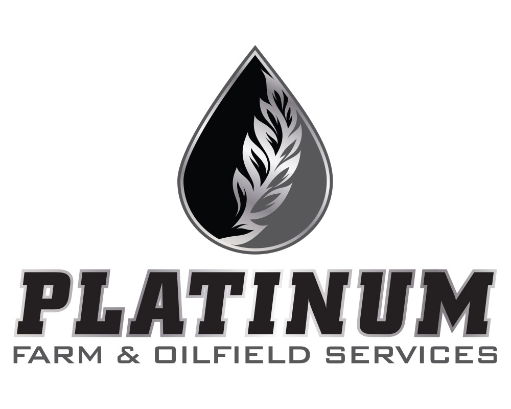
In the end, Colby chose the metal texture (as seen in the image above). The typefaces used complement the logo’s feel, with a bold serif font for the business name and a simple sans-serif font for the secondary text, ensuring legibility despite the long name.
Connect.
The final logo nails everything Colby wanted. It’s bold, eye-catching, and modern, perfect for business cards, truck decals, and apparel. The combo of wheat and an oil drop instantly tells you what Colby’s is all about. At the end of the day, customers know what they need; my job is to create something that delivers that message, even if it’s not exactly what they initially had in mind.
Graphic Design Skills Used: Vector Graphic Creation; Layout Design; Colour Theory; Typography


