Logo Design:
Integrity Welding Services
Kam contacted me through my website after checking out my portfolio and connecting with my design style. He needed a logo for his small welding business—something that he could use on his truck, clothing, and stickers. Kam had a specific idea in mind, but my job was to think outside the box and create a logo that truly worked for his business. So, I took his vision and ran with it, adding my own twist to make sure it stood out and represented his brand perfectly.
Project Details
Client: Kameran
Date: April 2024
Skills: Logo Design
Initial Concepts
Number of Designs
Turnaround Days
Think.
Kam had a cool idea for his logo – he wanted to incorporate a Celtic knot and chain. But when I researched the meaning of a Celtic knot, it didn’t really represent his business. So, I began researching the welding industry and found some unique symbols used in welding schematics. Armed with that fresh inspiration, I got to work designing a logo that truly captures the essence of Integrity Welding Services – preparing Kam’s vision and some of my own designs with industry-specific elements. My goal was to create a logo that’s unique, professional, and stands out in the welding world.
Design.
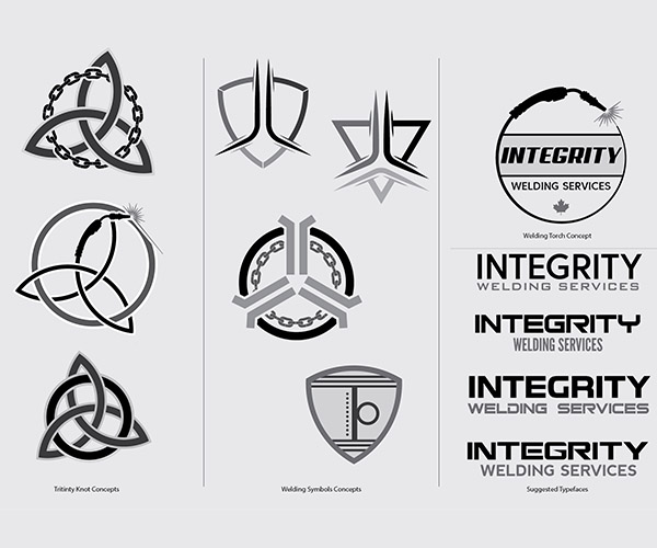
When it came to designing the logo for Integrity Welding Services, I wanted to create three solid concepts that would give Kam a range of options.
- Celtic Knot – I ran with Kam’s original idea of incorporating a Celtic knot and a chain. I crafted three versions of this concept: a classic Celtic knot within a circle, a Celtic knot and circle made of chains, and one that pushed the envelope by forming the Celtic knot out of a welding torch cord. Each version kept the essence of Kam’s vision while adding a unique twist.
- Welding Symbols – Next, I explored the welding industry’s symbols. I utilized welding schematic symbols, focusing on “Edge Flanged,” “Concave,” and “Arc Spot” to create some abstract designs. These designs brought a modern, technical edge to the logo, representing the precision and expertise integral to welding.
- Welding Torch – I developed a more direct concept using the welding torch and cord again, I created a design where the cord formed a circle, enclosing the company name. This approach was straightforward but still professional and visually appealing.
These three distinct concepts gave Kam a variety of styles to choose from, ensuring that his final logo would perfectly reflect the spirit and professionalism of Integrity Welding Services.


Once Kam had some time to review the designs, I got the following response back
“The designs look cool, I like the edged flange in the triangle concept. It has a unique kinda look to it I would have never thought of, nice work!”
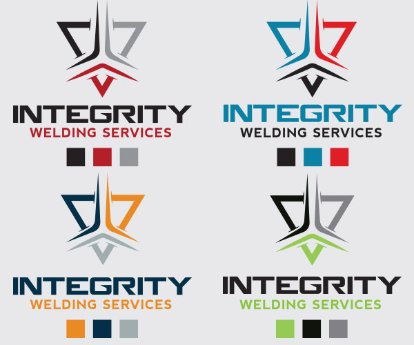
So, another logo decision had been made. It was time to add a splash of colour to the chosen design. I presented four different colour schemes, each chosen to evoke specific emotions and convey distinct messages.
- Red/Grey/Black: This scheme combines the intensity of red, the neutrality of grey, and the strength of black. Red symbolizes energy, passion, and action, perfect for a dynamic and hands-on industry like welding. Grey adds balance and sophistication, while black emphasizes power and professionalism. Together, these colours create a bold and authoritative presence.
- Reds/Blue/Black: Adding blue to the mix introduces a sense of trust and reliability. Blue is often associated with dependability and stability, essential qualities for a welding business. The red adds energy, the black adds strength, and together, they form a colour palette that communicates both action and trust.
- Navy/Orange/Grey: Navy blue exudes professionalism and trust, while orange adds a touch of creativity and enthusiasm. This combination is both professional and approachable, with grey providing a neutral balance.
- Black/Grey/Lime Green: This modern and edgy scheme uses the starkness of black and grey with the fresh, vibrant touch of lime green. Lime green is often associated with innovation, growth, and freshness, giving the logo a contemporary and forward-thinking vibe.
Each color scheme was carefully considered to ensure it aligned with Integrity Welding Services’ brand message, providing Kam with options that would resonate with his clients and stand out in the industry.
Connect.
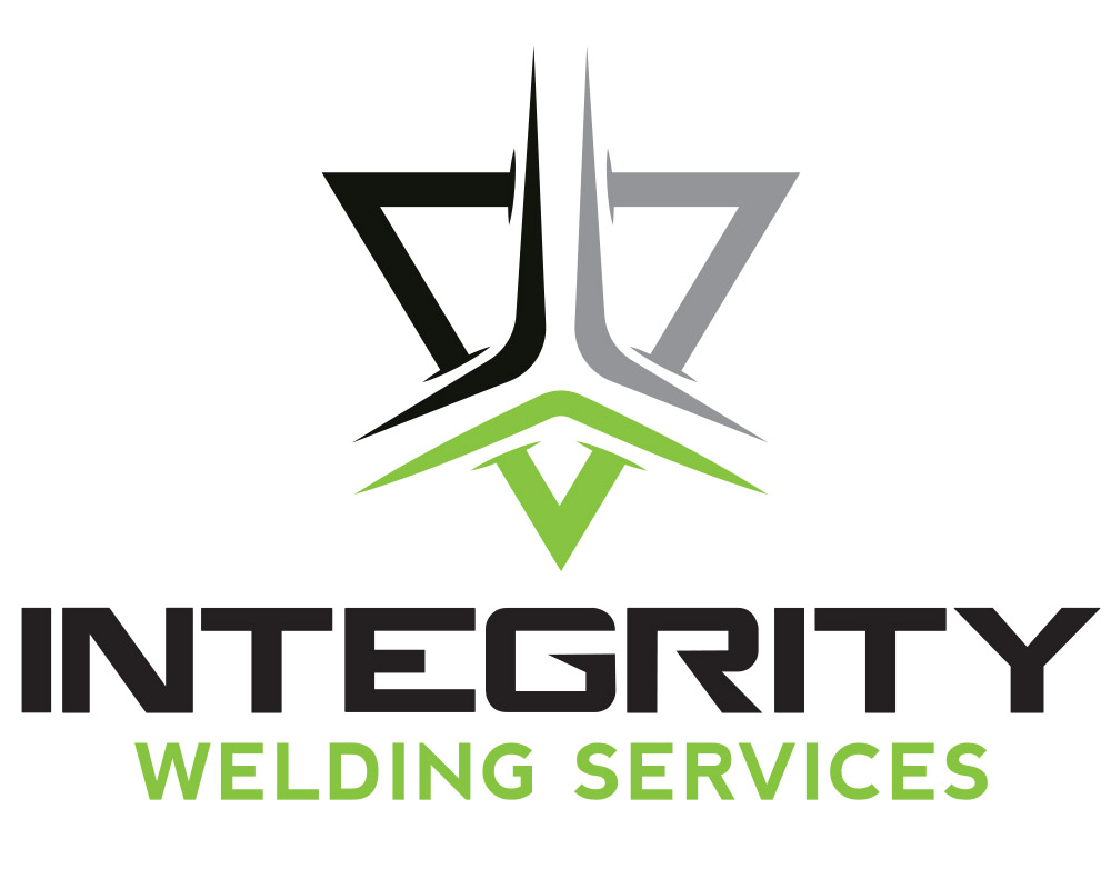
The chosen Edge Flange/Arc Spot design for Integrity Welding Services sends a clear and powerful message to its audience. By integrating welding schematic symbols into the logo, we created a design that looks visually appealing and speaks directly to the heart of the welding industry. The Edge Flange and Arc Spot symbols are universally recognized within the field, and their incorporation into the logo showcases Integrity Welding Services’ deep understanding and expertise in the craft.
Researching the welding industry allowed me to take the project in a different direction than Kam initially envisioned. Instead of the traditional Celtic knot and chain concept, which didn’t fully capture the essence of his business, I created something more innovative and industry-specific. This research-driven approach led to a design that is both creative and relevant, highlighting the technical proficiency and modernity of Integrity Welding Services.
Kam appreciated the fresh perspective and loved the creativity infused into the logo and couldn’t wait to showcase the new logo on his truck, clothing, and stickers, knowing it would resonate with his clients and set his business apart from the competition.
Graphic Design Skills Used: Vector Graphic Creation; Layout Design; Colour Theory; Typography

