
Graphic Design | Fire Product Catalogue | Electrogas
Red Deer, Alberta
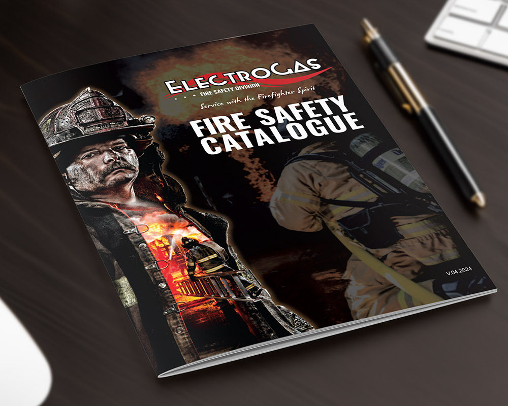
Think.
Conceptually for the Fire Product Catalogue for Electrogas Monitors Ltd., I pulled inspiration from the already-designed Mini Product Catalogue (also created by Arktos). I aimed to elevate the visual interest by incorporating striking images of firefighters and fire safety. This would enhance the overall appeal but also resonate with the target audience. Electrogas envisioned a catalogue that stood out through bold design elements while maintaining coherence with the brand’s existing visual identity and it was my goal to deliver exactly that.
Design.
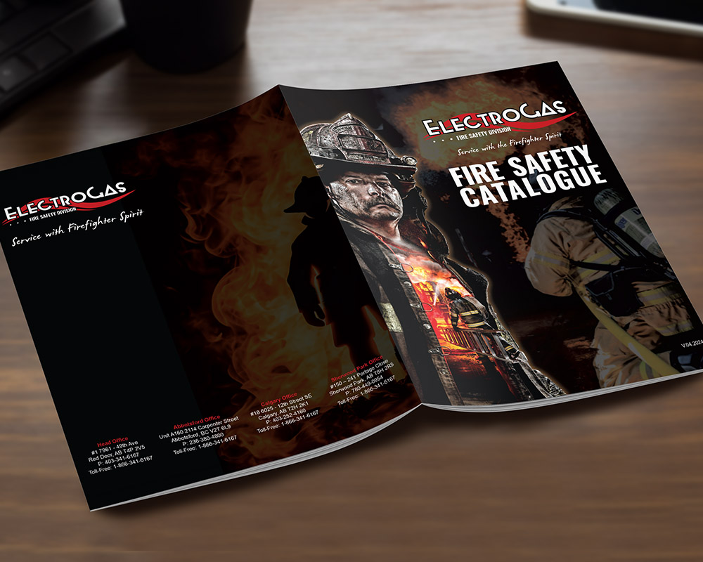
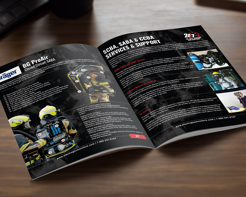
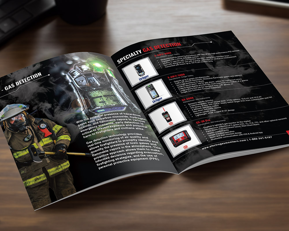
As mentioned above, the previously designed Mini Catalogue was the inspiration for this design. The key differentiation factor was the use of a dark background with subtle grey flames. This design choice created contrast with the white text, making the content stand out sharply and ensuring readability. The dark background also added a sense of depth and urgency, aligning with the theme of fire safety.
I developed various layouts to display product features and benefits in new and interesting ways. This approach kept the content fresh and engaging, allowing for different features of each product to be highlighted effectively. The organization of the catalogue was meticulously planned, with ample “white” spacing to ensure the content was easy to read and not overwhelming. The thoughtful layout made the catalogue user-friendly, allowing viewers to absorb information effortlessly.
Connect.
In crafting the Fire Product Catalogue, the goal was to create a visually stunning and informative resource that communicated the importance and quality of Electrogas Monitors Ltd.’s fire safety products. The result was a catalogue that showcased their products and reinforced their commitment to safety and innovation in the industry.