
Project Details
Client: Jason
Date: September 2020
Skills: Logo Design
Initial Concepts
Total Revisions
Turnaround Days
The Client
Another returning customer, Jason, who initially had me design the logo for his Western Canada Soccer Academy, reached out to me in late August to have a club logo designed for the team he would be running out of The Dome in Red Deer, Alberta. Jason initially provided me with some samples and ideas on what he wanted his logo to look like and the uniforms associated with the club – so all the original ideas were based on those ideas.
Conceptualize
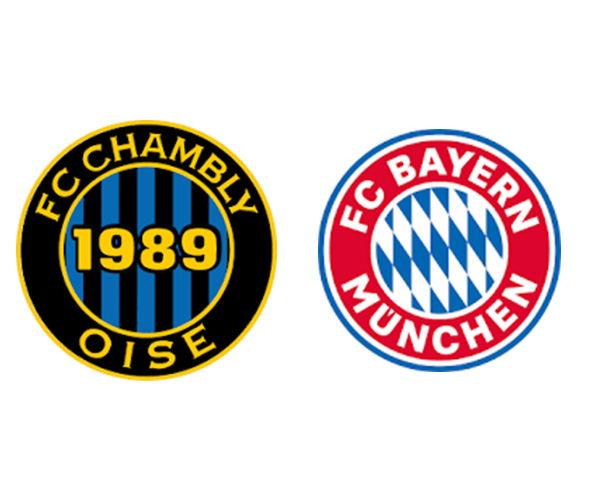
As mentioned above, Jason sent me some samples (seen here) of what he initially wanted the logo to look like. He specified certain aspects of each of these images that he wanted to incorporate into his design and also indicated that the colours would be yellow and black – with a little bit of blue. Using Jason’s instructions I set off in creating the first few concepts. As is the case with most graphic projects, the whole process continued to change and evolve and as you will see below – the final product is quite different than the original concepts.
Create
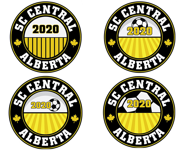
The creative process began basing my designs on the information received during the consultation. The three initial designs provide different options in terms of typography, layout design, and graphic representation inclusions (cross, stripes, maple leaf, etc.).
The first round of revisions used aspects of all the concepts to create a new logo layout that now incorporated a reference to The Dome facility and change the shaping of the stripe to indicate more of a “wheat-field” look.

Next, once the crew at The Dome reviewed the latest revisions of the logo, they called for another meeting. The initial idea for the logo was no longer deemed a proper representation of what they wanted. It seemed they were looking for more reference to the Dome facility itself. During the meeting, we discussed a few ways to include a reference to The Dome, including using the ‘swoosh’ found in The Dome logo or what the facility itself would look like from the MacKenzie road in Red Deer.


At this point, we were honing in a completed design once these new renderings were reviewed. We all felt the MacKenzie Road concept was too busy and complicated for a logo that would be embroidered and silk-screened onto uniforms and other clothing.
So from there, we set out to revise the ‘swoosh’ logo by changing/moving different elements in the design around to give you the final product shown at the top of the page.
Communicate
Although the process to get to a final product was more involved than in some cases, it is always important to ensure the correct message is being communicated. The final design communicates the connection to The Dome in a more subtle way. It also uses highly recognizable elements, such as the Canadian Maple Leaf and soccer balls to communicate where and what the logo represents. It is also a much cleaner design, which will help them in the branding of the club as they move forward.
Graphic Design Skills Used: Vector Graphic Creation; Layout Design; Colour Theory; Typography