Project Details
Client: Ian
Date: July 2021
Skills: Logo Design
Initial Concepts
Rounds of Revisions
Turnaround Days
The Client
Ian Hall, the current president of the Heritage Junior Hockey League contacted me in early January looking for a fresh rebrand for their league. The Heritage Junior Hockey League has been around in Alberta since 1986, and in fact, I was in the league from 1999 – 2003. It has been a proven ground for young hockey players that have aged out of minor hockey to continue showcasing their skills.
Conceptualize
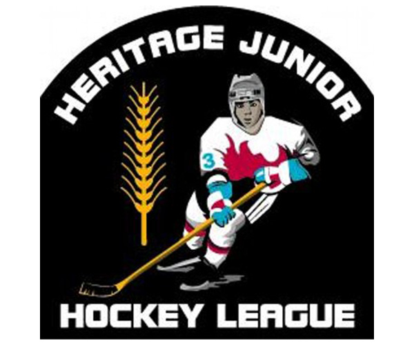
During our discussion, Ian indicated that their old logo (seen left) was very old, outdated and poorly design. Back in 1986, I’m sure this logo worked fine, but as the calendar continued to turn the design became further and further away from the identity of the league.
The new concepts they were hoping to see would be an updated, more modern version of their current logo, something that communicates or relates to the province of Alberta and/or a text-based or initials-based design that is simple, clean and modern.
Create
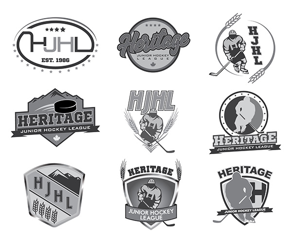
In order to complete all the requests made during the briefing, I decided to create 3 different concepts, with multiple versions of those concepts to cover all my bases.
1. Typeface/Initial-Based Designs
The first concept I developed was based on initials or typeface based. I found some inspiration from some past NHL logos used in the past and designed two variations, one that was a little more modern and one that referenced the past more – to tie into the name of the league (Heritage).
B. Modern Hockey Player Designs
As requested, I wanted to provide an updated version of their existing logo. I started by using a picture of Connor McDavid to update the hockey player to a more simple version of their previous logo. Little subtleties were added like a small ‘H’ in the centre of the jersey to represent the league. From there I paired the new hockey player with various elements that represent the province of Alberta or the league in the wheat stalks, mountains, stars and shields.
C. Moutain-Based Designs
The final concepts were based around probably the most representative element for the province of Alberta, the Rocky Mountains. One of the designs has a reference to hockey with the moving puck and the other is a shield enclosed design with not only the mountains but the wheat stalks to really drive home the Alberta reference that Ian wished to see.
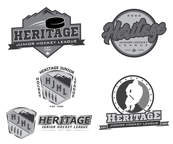
The first round of revisions took the number of concepts down from 9 to 4. There were minor adjustments to each design, mainly adding the established date of the league to each one. There were some subtle changes made to the typography in a few of the designs and minor adjustments to some of the elements, including the type of wheatstalk, the overall colour of the hockey player, etc. From the chosen design, I could tell immediately that they really wanted to focus on the name of the league, which isn’t too surprising – as these logos would be placed on each and every jersey in the league.
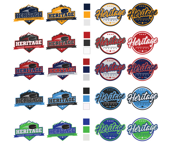
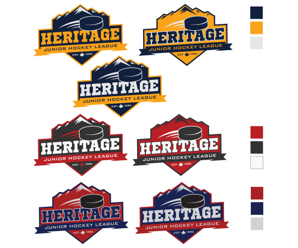
From there Ian and his team narrowed down their choices further and we set off to apply colour to the designs. I did some research on colour psychology and provide 5 different schemes to give them options on the overall look and feel they were after. This would be an important step as it would pave the way for the future branding direction of the league.
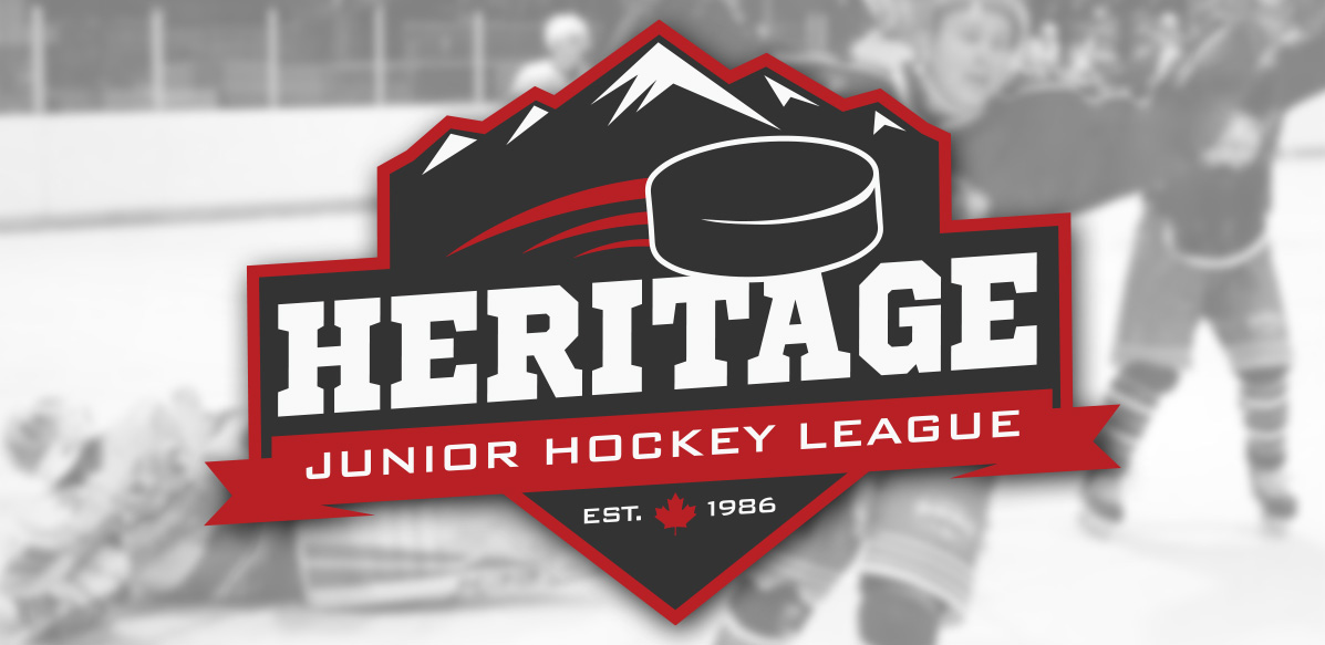
The final made logo decision was made to the mountain-based design and a low contrast colour scheme of black, red and white. I think that was a good choice, it wasn’t my personal favourite of the colours schemes but I think for the message it works quite well.
Communicate
The chosen design is a strong design with sharp lines, bold typefaces and strong imagery. It is a perfect representation of the history of the league, the province in which it operates and the overall message of the league. It is simple enough to be used in branding materials, such as hoodies and jerseys – but complex enough to stand strong in applications such as website design and social media usage.
Graphic Design Skills Used: Vector Graphic Creation; Layout Design; Colour Theory; Typography